What Defines Good Website Design in 2025?
What Defines Good Website Design in 2025?
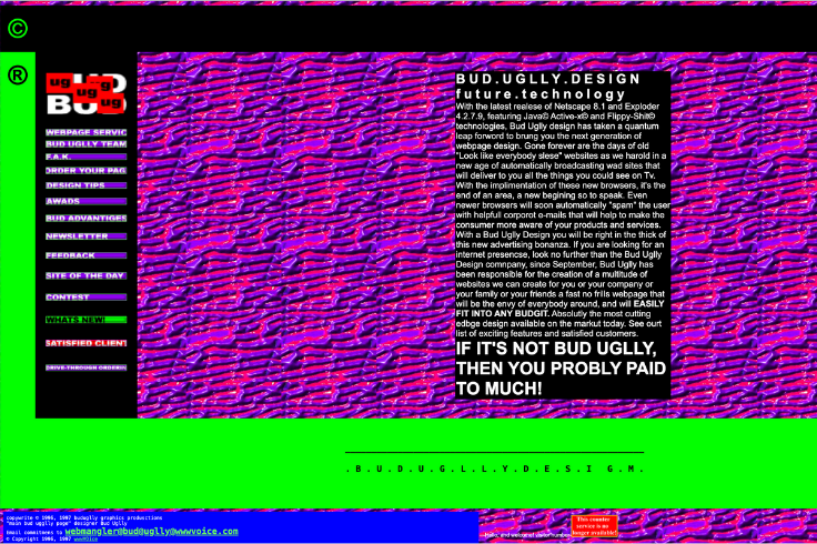
Do you remember what websites looked like in the early days of the internet? They were text-heavy, lacked design, overloaded with information, and had poor user interfaces. Below is an example of an old website from the web archive, one that is dedicated to exploiting all bad web design layouts in the 90s.
Bad website designs weren’t always intentional. Designers and businesses were simply working with the technology available at the time. But imagine if websites today still had the same clunky design, awkward interface, and frustrating user experience. You’d probably dread searching for information because of slow loading times, hard-to-read layouts, and an overall headache for the eyes.
Thank goodness web design has evolved, right? In this article, we're sharing what makes a good website design in 2025 and how you can apply it to your site!
TL;DR? Here's what's inside...
What Defines Good Website Design in 2025?
TL;DR? Here's what's inside...
Elements of a good website design
#1 Clean layout beats cluttered every time
Powerful color combinations and what they convey
#9 Dark mode and adaptive design
Website design questions to ask yourself
Do you have a good web design in 2025?
Elements of a good website design
What really makes a website design good? Is it the sleek aesthetics, the effortless navigation, or that it just feels right? Honestly, it’s all of the above! More than looking pretty, a well-designed website makes sure visitors stay, explore, and take action. Here’s what you need:
Clean Layout
Bold Typography
Strategic Use of Colors
Engaging Visuals & Media
Intuitive Navigation
Consistent Branding
Whitespace & Spacing
Custom Icons & Graphics
Dark Mode & Adaptive Design
Let’s go deeper into each of these elements below.
#1 Clean layout beats cluttered every time
Layout is the placement of design elements found on your website. How you present these elements in your web design speaks volumes. A clean, well-structured layout can make you look professional and trustworthy, while a messy, disorganized one can overwhelm visitors and drive them away.
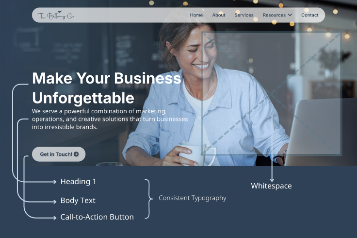
A clean layout is simple, clear, and functional, giving users a positive experience. It uses ample white space, minimalistic design, consistent typography, and a clear visual hierarchy to guide users through the content effectively. To give you a clearer depiction, take a look at the screenshot of our website homepage.
Examples of Clean Layouts
Minimalist Layouts: Focus on essential elements only, with sparse use of colors and simple navigation. Example: Lars Tornoe
Grid-Based Layouts: Use structured grids to organize content neatly, ensuring alignment and balance. Example: Ikea
Magazine-style layouts: Use typographic hierarchy and white space to guide readers through articles. Example: Wired
#2 Bold typography
Typography is the art of arranging text to make it readable, clear, and visually appealing. In web design, bold typography grabs attention, creates hierarchy, and reinforces branding.
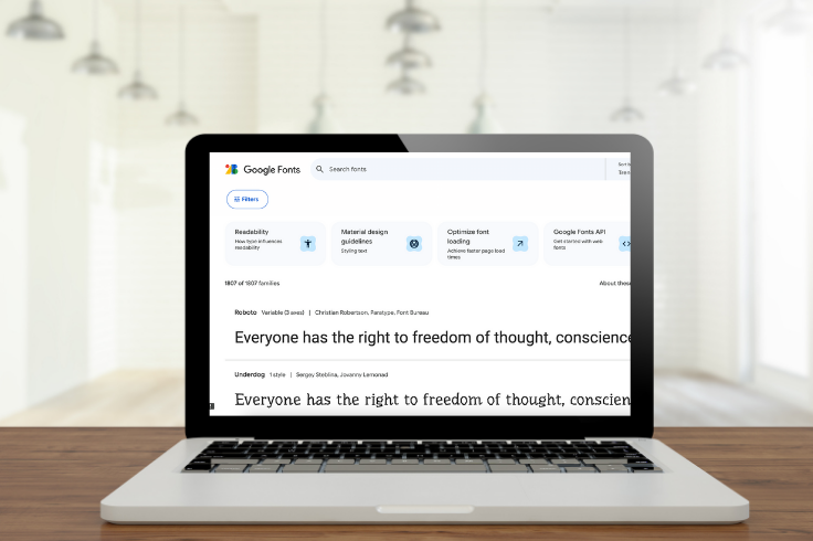
A well-thought-out typography combination makes a huge difference in readability and aesthetics. You can never go wrong with pairing a strong serif font for headers with a clean, modern sans-serif font for body text. This contrast creates a perfect balance of elegance and readability.
Need help picking the right fonts? Canva has article-sharing font pairings that complement each other and match your design effortlessly.
#3 Strategic use of colors
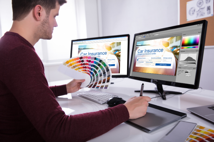
Like a painter bringing a masterpiece to life, colors add depth, emotion, and personality to a website. When used strategically, they enhance branding, improve readability, and subtly guide visitors toward key actions.
A well-chosen color palette sets the tone, highlights important elements, and keeps the design visually cohesive without overwhelming the user.
Powerful color combinations and what they convey
The right color combination not only makes your website visually appealing but also reinforces your brand’s message and connects with your audience.
Black & Gold – Elegance, luxury, and high quality. Often used by premium brands, luxury goods, and high-end services.
Blue & White – Trust, professionalism, and clarity. Popular in corporate websites, tech companies, and healthcare industries.
Red & Black – Boldness, power, and urgency. Frequently seen in sports brands, entertainment, and high-energy businesses.
Green & Earth Tones – Growth, sustainability, and health. Commonly used in eco-friendly brands, wellness industries, and organic businesses.
Pink & Purple – Creativity, playfulness, and innovation. Favored by beauty brands, lifestyle blogs, and artistic industries.
#4 Engaging visuals and media
Eye-catching visual designs and media bring your site to life and keep visitors hooked. And since we process visuals way faster than text, your images, graphics, and videos need to work together to enhance your message, not distract from it.
High-resolution photos, custom illustrations, and subtle animations make your site more engaging, while excessive movement can be overwhelming.
Some sites offer free, high-quality photos and videos to level up your visuals without breaking the bank. Pexels lets you filter by color, making it easy to match your brand’s aesthetic, while FreePik offers even more filter options, including color, age, ethnicity, and gender, so you can find media that genuinely fits your brand’s message.

#5 Intuitive navigation
Your visitors shouldn’t feel like they need a treasure map to find what they’re looking for. Every design, detail, and element inside your website should be easy to navigate. Your menu should be clear, your buttons obvious, and your layout easy to follow. If visitors have to guess where to click, then your website is out.
Nobody has the time for a confusing website. Keep it simple, make it smooth, and guide them exactly where they need to go. One user design inspiration of what NOT TO DO comes to mind. This is from the site called userinyerface.com and will truly give you a good laugh.

#6 Consistent branding
Your website is basically your brand’s digital home. Thus, don’t make your website look like a garage sale of random fonts, colors, and design styles. Everything should flow together and feel like you. Consistency builds trust. When your colors, fonts, and design elements stay on brand, people instantly recognize your business and know they’re in the right place.
One great example is the e-commerce website Amazon. Amazon’s branding revolves around its iconic smile logo and customer-centric messaging. Whether on the website, app, or packaging, Amazon consistently delivers a simple and intuitive experience that reinforces its brand promise.

#7 Whitespace and spacing
Think of whitespace as the breathing room your website needs. It’s like finally getting the house to yourself after a long day. Whitespace is found between text, images, and design elements that keep everything looking clean, organized, and easy on the eyes.
While whitespace creates balance and prevents visual clutter, spacing controls the distance between elements to improve readability and flow. A good website design maintains a balanced ratio of whitespace to content and consistent spacing between sections, text, and images to create a sleek, modern, and stress-free look.
Of course, these ratios aren’t set in stone; you can tweak them based on your brand’s style. But keep in mind that good spacing makes your site feel polished and professional, while cramped design can overwhelm visitors.
Pro tip: Don’t be afraid of empty space! It’s intentional design magic that makes your content shine.

#8 Custom icons and graphics
Aside from your logo and business name, what visual element makes your brand instantly recognizable? Answer: custom icons and graphics! These creative touches make your brand stand out, adding personality, originality, and a professional touch to your website. They also help break up text, guide users, and improve navigation and engagement.
One of the best examples of custom icons and graphics comes from Google. Their cohesive set of custom icons creates a seamless, recognizable experience across all platforms. Google proves that well-designed icons do more than just look good. They enhance usability, add functionality, and build brand recognition.

#9 Dark mode and adaptive design
Last on the list are more features of good website design rather than core elements. However, we included them here because they improve user experience and make your site more accessible to a wider audience. Let’s talk about dark mode and adaptive design.
You may use dark mode to protect your eyes from too much doom scrolling at 3 am, but it serves a more beneficial purpose for people with visual difficulties. Dark mode reduces glare, enhances contrast, and makes reading easier for many users. Offering this option ensures a more comfortable browsing experience for everyone.
Adaptive design, on the other hand, ensures your website looks and functions flawlessly on any device. Whether someone’s using a laptop, tablet, or phone, your site should automatically adjust to different screen sizes, resolutions, and orientations. A well-designed adaptive website prevents frustrating layouts and endless zooming, making navigation smooth and seamless.
Prioritizing these features not only improves usability but also shows that you care about all your visitors. A truly good website design is one that everyone can enjoy.

Website design questions to ask yourself
Before revamping your site design or hiring a web design company, take a step back and evaluate where you are. Understanding your current design’s strengths and weaknesses will help you create a clear vision of what you want to improve.
Here are 10 essential website design questions to ask yourself before making any big design decisions:
1. Is my branding clear and consistent?
Your logo, color scheme, and typography should align with your brand identity. Design helps build trust and recognition, making your website look professional and cohesive.
2. Does my website have a strong visual hierarchy?
Visitors should immediately understand what’s most important. A clear page design and hierarchy guides users naturally, preventing frustration and improving engagement.
3. Are my images and graphics high-quality and relevant?
Using custom icons and high-quality images can make a captivating website that enhances storytelling and strengthens your brand identity.
4. Is my website easy to navigate?
If users struggle with website navigation, they’ll leave. A user-friendly design improves the experience and keeps visitors engaged longer.
5. Is my website mobile-friendly?
More people browse on their phones than desktops. Responsive web design ensures your site looks great and functions well across all devices, preventing frustration and lost traffic.
6. Am I using whitespace effectively?
A clear design improves readability, creates a sleek look, and makes content easier to digest, helping you achieve a beautiful website.
7. Does my website support dark mode or adaptive design?
Responsive design enhances accessibility, while dark mode reduces eye strain. These design features make your website more engaging, and user-centric design more effective.
8. Am I using colors strategically?
Colors influence emotions and actions. Choosing the right color scheme enhances branding, improves readability, and guides users through your site effortlessly.
9. Is my typography enhancing or hurting readability?
Typography plays a key role in user experience. The right font styles, sizes, and spacing ensure that content is easy to read while complementing your overall design concept.
10. Does my website reflect my goals and audience needs?
Your website should align with your business goals and visitor expectations. Best web design principles ensure your site is modern, effective, and engaging.
These website design questions will help you pinpoint what’s working and what needs improvement, making your web design project more strategic and effective.

Do you have a good web design in 2025?
Hopefully, this post has helped you figure out whether your business website is ready to stand out in today’s online universe. Whether your design is on point or needs a serious refresh, there’s one thing you should remember: your website is one of your biggest assets that can attract leads and drive sales.
Need expert eyes to revamp your website? Book a FREE discovery call with us!


